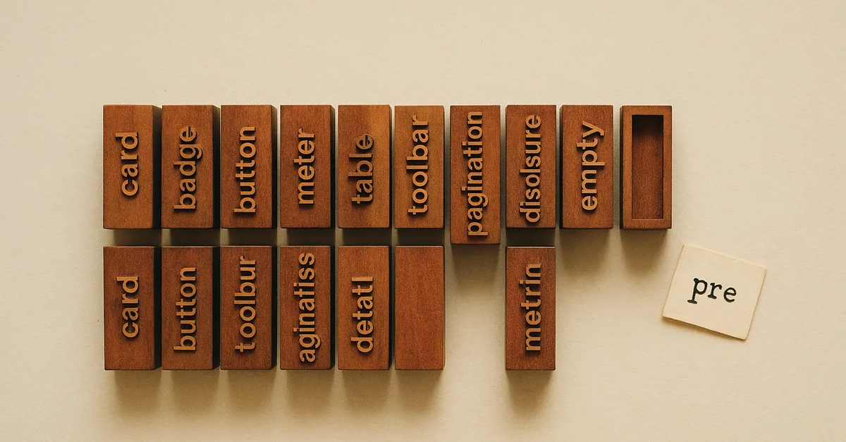
Is your landing page screaming for a bit of retro pizzazz, but you’re terrified of bloating your site with unnecessary JavaScript? Good. You should be.
We’ve all seen it. That slick, typing animation that makes a headline pop. Or maybe a cyberpunk vibe for your portfolio. It’s an instant engagement booster. Problem is, for years, the default solution meant pulling in entire libraries. Typed.js, anyone? Or worse, cobbling together setInterval scripts that made mobile browsers weep.
The Dark Ages of Text Animation
Let’s be honest. Before this whole pure CSS typewriter stunt became viable, it was a mess. JavaScript libraries were overkill. Rolling your own vanilla JS? Cue the layout shifts and repaints. Mobile users weren’t impressed. And the early CSS attempts? Embarrassing. Animating width was a joke with variable-width fonts. The cursor danced. It looked… amateurish. A true proof to how far we’ve come.
Modern CSS: It’s Not Rocket Science
Forget the old hacks. Today, we’re talking pixel-perfect, character-by-character typing using just standard CSS. The magic ingredients? The ch unit (which is precisely the width of a ‘0’ character in your chosen font), the steps() timing function, and good old CSS keyframes. It’s surprisingly elegant.
And the code? Clean. Maintainable. No more sprawling CSS files. Nesting is your friend. Pairing it with steps() tells the browser: animate width, but not smoothly. Make it jump. Exactly one character at a time. Simple. Effective. No JavaScript required.
Drop This In. Watch It Go.
Here’s the goods. Copy-paste this and see for yourself. It’s a fully optimized snippet. Ready for your next killer startup page.
<div class="typewriter-container">
<h1 class="typewriter-text">Coding the future...</h1>
</div>
<style>
.typewriter-container {
display: flex;
justify-content: center;
align-items: center;
background: #0f172a;
padding: 2rem;
border-radius: 8px;
}
.typewriter-text {
/* Step 1: Use a monospaced font so every character has the exact same width */
font-family: 'Courier New', Courier, monospace;
font-size: 2rem;
color: #38bdf8;
/* Step 2: Prevent text wrapping and hide overflow */
white-space: nowrap;
overflow: hidden;
/* Step 3: Create the flashing cursor using a right border */
border-right: 3px solid #f43f5e;
/* Step 4: Set the initial width to 0 */
width: 0;
/* Step 5: Run the typing and blinking animations */
/* "17" represents the exact number of characters in "Coding the future..." */
animation:
    typewrite 4s steps(17) forwards,
    blink 0.8s step-end infinite;
}
/* Keyframe to expand the width character by character */
@keyframes typewrite {
from { width: 0; }
to { width: 17ch; } /* Using ch units ensures exact character-by-character reveals */
}
/* Keyframe to make the caret blink */
@keyframes blink {
from, to { border-color: transparent; }
50% { border-color: #f43f5e; }
}
</style>
Common Pitfalls?
Don’t mess this up. It’s easy, but people do. Three main traps:
- Proportional Fonts: This trick only works with monospaced fonts. Seriously. An ‘i’ isn’t a ‘w’. The cursor will drift. Just use Courier or something similar.
- Step Count Errors: The number in
steps()MUST match your text length. Exactly. Spaces, punctuation, the lot. Get it wrong, and you get awkward pauses. Or jumps. Debugging timing issues? Use Chrome DevTools’ animation timeline. It’s your friend. - Forgetting
white-space: nowrap;: This is a big one. Without it, your text wraps. Especially on smaller screens. The animation breaks. It’s a fundamental part of the illusion. Don’t skip it. It’s the glue.
Why This Matters
Look, this isn’t about reinventing the wheel. It’s about understanding that modern CSS is surprisingly powerful. We don’t need to reach for a sledgehammer (JavaScript) for every simple task. This typewriter effect is a perfect example. It’s performant. It’s clean. And it shows a shift. A shift away from JS bloat for visual flair. Developers should be embracing these CSS capabilities. Why? Because faster sites win. And developers who understand this win too.
My unique insight? This isn’t just about a cool animation. It’s a subtle jab at the past, and a preview of a future where performance is king, and developers are expected to know their CSS inside and out, not just rely on frameworks and libraries to do the heavy lifting. The PR spin is all about the cool effect; the real story is about reclaiming browser performance with native tools.